Join us for our first Developer Dispatch: The Making of Tython, with developer interviews, behind-the-scenes footage, and breathtaking, never-before-seen concept art. Journey through Tython, the planet where the first Force users assembled and the Jedi Order was established. Discover how writers, artists, designers, and other developers came together to create one of the most essential planets in Star Wars™: The Old Republic™.
Make sure to keep an eye out for more Developer Dispatches in the future! We’ll continue our tour through the BioWare Austin Studio and give you a deeper look inside the production of Star Wars: The Old Republic.
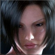
Personally I think it's their choice to go with "heroic proportions", which make the characters look completely hideous and unnatural. And yes, I do think I'll grow so sick of looking at those character models, which don't forget is what you'll be looking at more than anything, that I won't be able to play the game and enjoy it. Whoever decided to do that should be fed to a Sarlac.
It's so weird; in their concept art the characters look just fine. Though admittedly there isn't any concept art of female characters and it's the female characters I find look the most horrid.
I really, really hope that they'll fix that, but somehow I doubt it.
[EDIT] Added an image link to the video.


